|
|
Post by Columbus Egg on Jul 15, 2008 20:07:03 GMT -5
I could have slapped together something better on my 20 year old Commodore 64 and charged Noel half as much. Wanna try it without joking and give us a look at it? |
|
|
|
Post by castlecraver on Jul 15, 2008 20:50:57 GMT -5
Sorry but are you people all high? This cover looks like shit. Nope, not high right now. Its actually pretty good. You're just wrong.  |
|
|
|
Post by mercury3164 on Jul 15, 2008 21:20:52 GMT -5
i just got pretty high, and now the cover looks better...
|
|
|
|
Post by Clint on Jul 15, 2008 23:55:37 GMT -5
I like it. It is appealing to the eyes. Nice colors and some cool shit. Abstract. Inspired by the sixties definitely, but it doesn't feel cheap.
|
|
|
|
Post by Cast on Jul 16, 2008 1:23:56 GMT -5
its one of the best covers of this decade. very colorful and love the references to the songs. This album is turning out to be very interesting
|
|
|
|
Post by MEANSTREAK on Jul 16, 2008 15:33:37 GMT -5
I could have slapped together something better on my 20 year old Commodore 64 and charged Noel half as much. Wanna try it without joking and give us a look at it?  ;D  c'mon man I can't do ANYTHING without some joking! |
|
|
|
Post by MEANSTREAK on Jul 16, 2008 15:35:46 GMT -5
seriously though there are plenty of artwork makers on this forum like Marcosoasis and James Dalt who make bootleg covers that look ten times better than this cheap Beatles rip off cover.
|
|
|
|
Post by silentsun on Jul 16, 2008 16:07:24 GMT -5
Any idea if this album is gonna be on vinyl or not? I've preordered the CD but I really want the vinyl!
|
|
|
|
Post by Columbus Egg on Jul 16, 2008 17:19:15 GMT -5
seriously though there are plenty of artwork makers on this forum like Marcosoasis and James Dalt who make bootleg covers that look ten times better than this cheap Beatles rip off cover. The trouble with that comparison (and I've seen pretty much every bootleg cover), as talented as those guys are, I don't think any of them ever really made something this ambitious. Their work is usually a play on the album's art, or employs something the band wore/held/played whatever, something in those lines. They could've done a better job on Familiar To Millions, I'd give you that, but to conceptualize a cover by sticking an image to a whole new album is another ball of wax, IMO. The cover's probably average at best in the art world, but it's at least better than the last three covers. I'm glad the band at least wanted something that looked like this. |
|
|
|
Post by MacaRonic on Jul 19, 2008 9:22:26 GMT -5
The artwork is pretty cool-reminds me of The Beatles!! I love the colouring, a lot better than Don't Believe The Truth's sleeve, which was their worst!!! Can't wait for the album!!
|
|
|
|
Post by curlies on Jul 31, 2008 3:43:50 GMT -5
|
|
|
|
Post by curlies on Jul 31, 2008 7:59:40 GMT -5
I've uploaded the HIGH RES design of the cover. If you want to print a big poster in a very good quality full of details : www.sendspace.com/file/g5pf38Format HD press ready to print. Samples (Normal size in 100 %) : 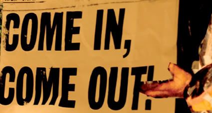  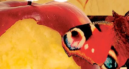   |
|
|
|
Post by supersonic8587 on Jul 31, 2008 8:44:53 GMT -5
Holy shit that's awesome thanks for that curlies. You really can see all the details in that hi res version. Notice the faces behind the mushroom cloud. Kinda freaky.
|
|
|
|
Post by 32shutout on Jul 31, 2008 9:04:27 GMT -5
That's amazing, thanks for this curlies- i only just now noticed the face behind the mushroom cloud! |
|


 c'mon man I can't do ANYTHING without some joking!


